
Northwest Viking Ship
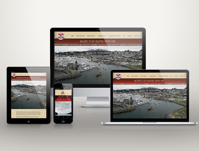
What started as a family promise spanning six generations has unfolded into an epic production: an authentic replica of a Norwegian Viking ship, taking eleven years to build, and another year to get coast guard certified. Valkyrie is a magnificent 56 foot hand-crafted vessel I had the opportunity to view in the process of being built in Anacortes, Washington.
While the site was being certified, it had a ‘coming soon’ page with no navigation or footer, and all the interior content hidden from search engines. The home page had, and still has, a pop-over with an announcement that can easily be turned on and off, and edited.
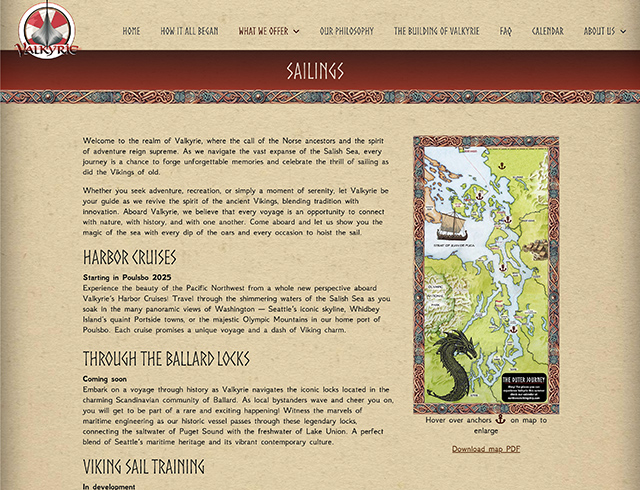
With a project this special, I wanted to make sure the site had features and an engaging interface that would reflect the love and hard work that went into the creating the ship. I worked closely with their sign-maker who provided wonderful graphics, including some of the illustrations of dragon heads, the braided wood borders, and the maps. The parchment background, darker on right and left, and sepia tints added to images create a historic atmosphere.
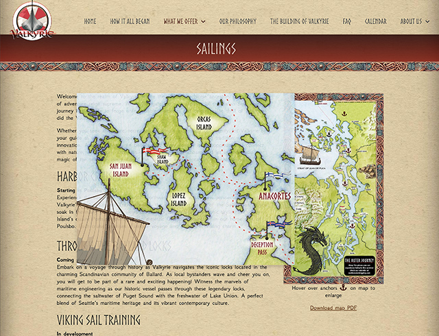
In the ‘what we offer’ section, you can hover over an anchor to enlarge that specific area of the map.
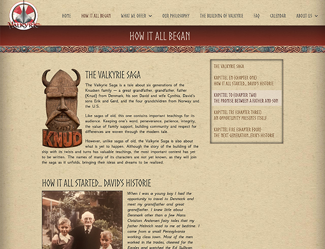
The story behind the ship is as interesting as the ship itself. They wanted it to read like a story, complete with a table of contents. I linked the TOC to the headings for in-page navigation and a decorative link area.
The fonts used are Norse and GFS Neohellenic, available through fonts.google.com.
For booking, they went with Starboard Suite. This was very easy to implement with WordPress. I highly recommend using 3rd party software for booking and calendar features. While WordPress offers these services through various plugins, they can be difficult to set up.
The site uses custom templates for the header, title bar, and footer. I created a separate template for headings that broke into two lines; on mobile, keeping the ‘sticky’ element with the fading background and border below appearing in the right place was tricky and required a lot of attention.